- Magestic's Newsletter
- Posts
- You're not using Figma right ...
You're not using Figma right ...
Variables, modes, and all that jazz
Karina Minanov
September 15, 2023
Alright, I’m going to be real with you guys. Welcome to honesty hour! The job market these days is … well … tricky to say the least. Tech companies that previously provided some semblance of job security are continuing to downsize. VC funding is currently on the decline, and it’s been pretty rough trying to land a full-time gig as a designer. I haven’t reached full-blown crisis mode yet, but I’m definitely revving up to it (I may or may not have recently cut bangs just to feel something. Judge me at your leisure, I deserve it). That being said, these past few rocky months have had a nice, little, unexpected upside. We’ve all been told at one point or another, “When one door closes, another opens.” Cheesy metaphors aside, the trials and tribulations of a seemingly never-ending interview cycle have pushed me to unlock a whole new level of Figma fluency.
In June at their annual conference Config, Figma released a bundle of new features for building design systems at scale—notably, variables and modes. Most of us are already pretty comfortable using Figma’s local styles and libraries to maintain design consistency. However, some of us (myself included until T-plus 2 weeks) are still confused by this introduction of variable collections and mode functionality. Is Figma trying to trick us? Why is Adobe hellbent on making software so complicated? Did anyone actually ask for this? I’ll admit, I was skeptical at first too (and kinda pissed off) … but now having done the grunt work, I’ve come to understand the hype. Variables are essentially an underutilized Swiss Army knife—they can be used to create auto-responsive layouts, to edit global styles with precision, and to mitigate (inevitable) miscommunication during dev handoff.
Tired of reading?! I’m tired of writing. Time to learn about variables and unleash your inner Figma mastermind.
🔡 Definitions
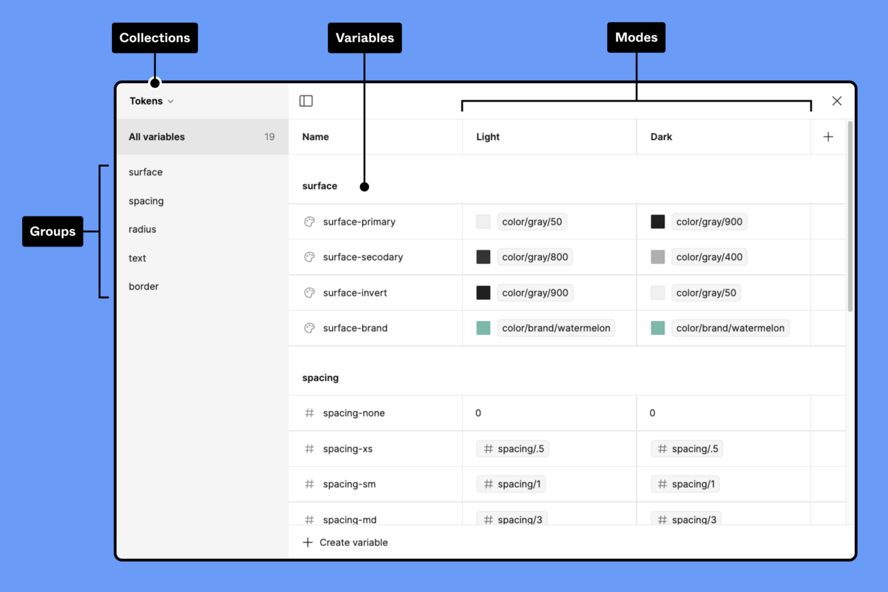
Style = stores multiple design values such as gradients or shadows; can reference variables
Variable = stores individual design values (HEX #, color name, text styles, spacing, etc); each variable can have multiple modes
Top tip: Always use variables where you can. Only rely on site styles when storing multiple design values.
Mode = represents different design states and themes (light v. dark mode, text language, device sizes); critical to responsive design

Design System = encompasses a wider range of design elements (components, spatial properties, etc.) that can be pieced together in boundless ways to guide a specific user experience. Design systems always include guidelines for implementation and are infinitely scalable.
Style Guide = compiles visual design aspects (typography, color palette, etc.) for the sake of continuity; limited scalability
👷 Setting up a design system using variables and modes
I highly recommend reading these two short articles to get yourself up and running. I find them loads easier to digest than Figma Learn.
Migrating from color styles to local variables in Figma: A simple overview of design tokens and primitive v. semantic variables
How I Structured My Design System Using Figma’s New Variables: Can be used as a step-by-step to build a reusable design system with auto-responsive properties
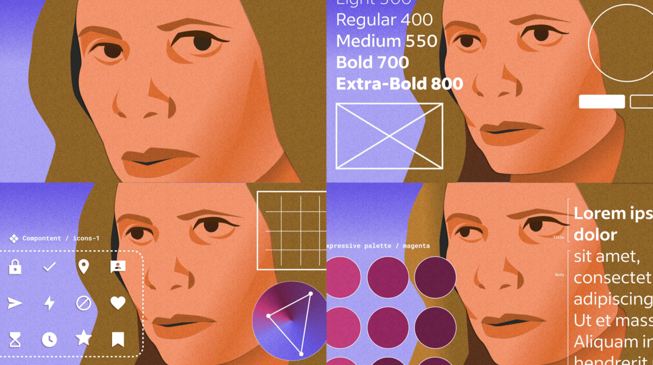
Bonus! Wondering where I swiped that thumbnail? Check out this article to learn more about design systems in general.
🔌 Featured plugins
A main friction point when building out a design system from scratch is that you rarely have full clarity as to what the final design will or should look like when crafting reusable components such as CTAs and icons. Sometimes, we’re just too time crunched to lo-fi wireframe every single screen before slapping on the pretty stuff. And inevitably, we end up having to go back and manually link instances to a component library that was created after the fact. Good thing is … these plugins exist:
Devs confused by your user flows? Personally, I’d be more than happy to live out the rest of my God-given days without ever touching Figma’s prototype tab every again. Sound familiar? These plugins are for you:
Autoflow: Illustrate user flows and diagrams with idiot-proof arrows and minimalist terminal styles
Overflow: Need that extra somethin’ somethin’? Illustrate, label, and color coordinate user flows. Plus, present designs using a playable bird’s eye view (aka view all screens at once rather than Figma’s native one-at-a-time approach)